Case study / Banking / 2026
Calculators, Made to Be Understood.
HOW IT STARTED
A Number With Nowhere to Go
BOQ Group’s home loan calculators needed to step away from the third-party licensed calculators, seeking calculator designs that fit the group’s own brand, sharpen the underlying UX, and stand ahead of major competitor banks’.
Borrowing Power, Refinance, Term Deposit, Key Facts Sheet, Stamp Duty, Loan Repayments, Principal & Interest and Offset were top 9 highest priority calculator amongst wider suite, carrying the most customer-conversion opportunity and legal weight.

Borrowing Calculator
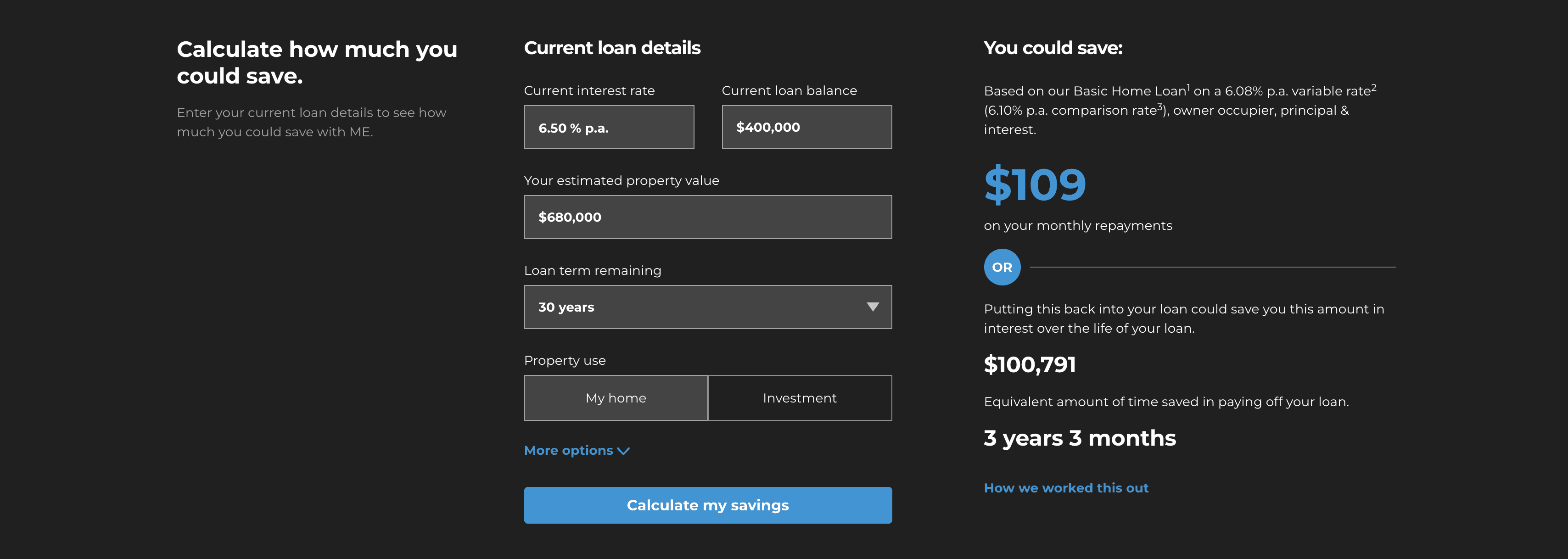
Refinance

Term Deposit

Key Fact Sheet

Stamp Duty
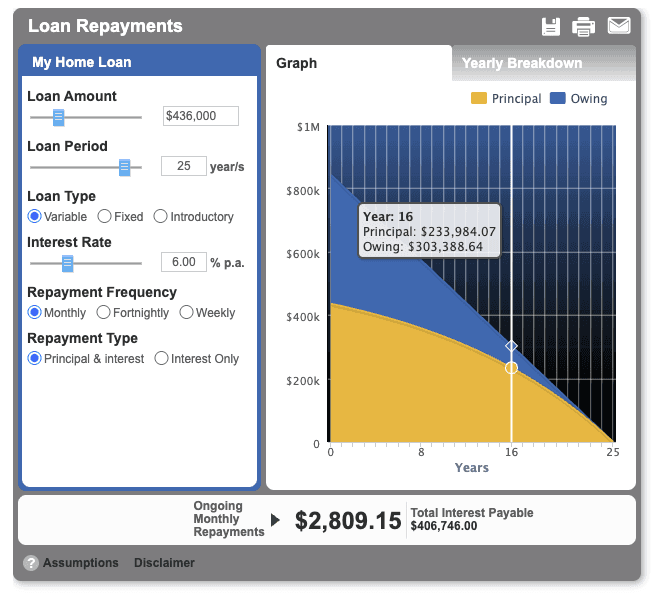
Loan Repayment

Principal & Interest
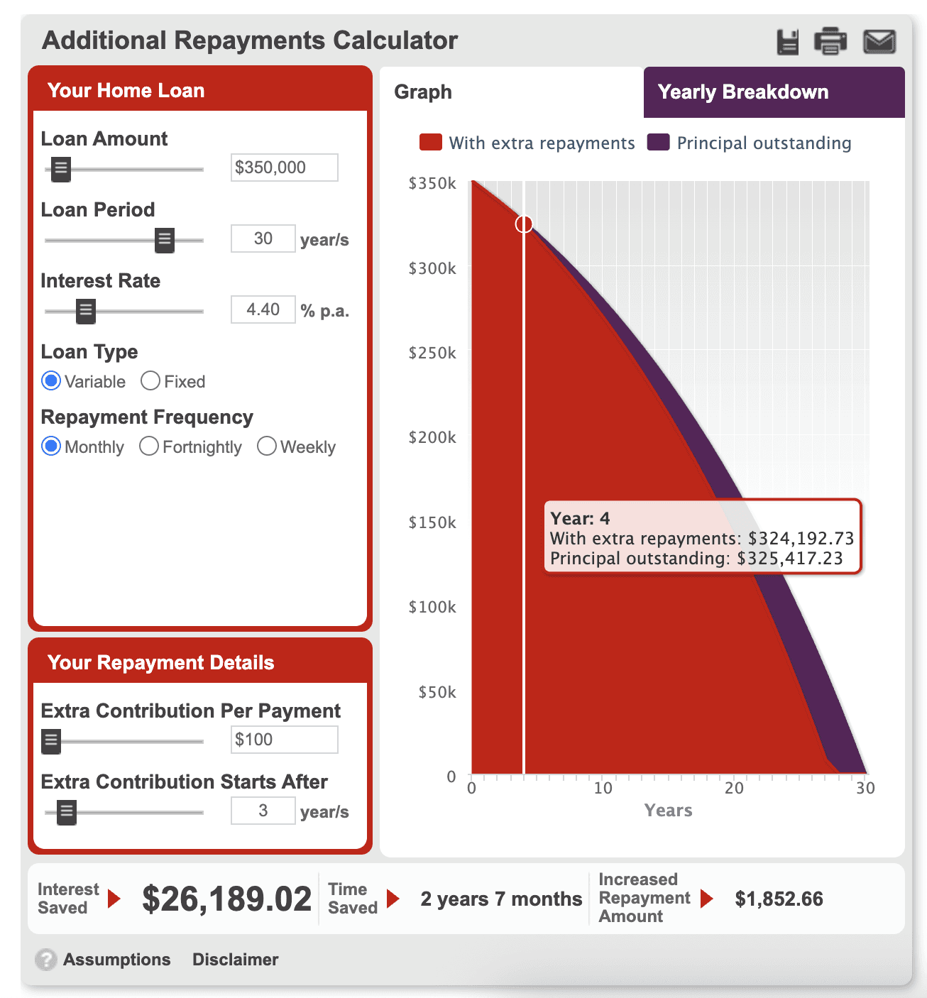
Extra Repayment

Offset
Calculators Current state
Each ran on a 2010-era idea of what a calculator should look like. Those legacy tools got the numbers, but not the context, and rarely a next step.
THE LANDSCAPE
Four Brands, One System
Four BOQ Group banks: ME Bank, BOQ, BOQ Specialist (BOQS) and Virgin Money Australia (VMA), are moving to a first-party build on their existing AEM platform – one interaction system underneath, reading as four distinct brands on top. ME’s copy cheekier and more conversational, while others are more corporate and neutral.
2 designers · 4 brands · 8 weeks

THE MAKING OF
Designing for Understanding, Not Just Accuracy
GROUNDWORK
Reading the Room First
The existing calculators were audited field by field, then competitor calculators across major banks were cross analysed for essential inputs and extra features on serving more accurate context for the average user.
That fed a set of personas built around why someone opens a calculator in the first place: not just first home buyers, but brokers pulling a number mid-meeting, investors checking a deal against a portfolio, existing homeowners weighing a refinance.


Persona & Input matrix
MAPPING USER JOURNEY
Different People, Different Journeys
Each persona was mapped to a proposed journey through the suite, since a first-time buyer exploring affordability moves through these tools very differently to a broker under time pressure who needs one number, fast.

User Journey by personas
As result, 8 tools were consolidated into 2 suites
• Home loan
• Loan Optimisation

Calculator suite
COPYWRITING, SAY LESS
Jargon, Translated
Progressive disclosure kept every form lightweight up front, surfacing situational fields only once they applied.
Copywriting did a lot of the actual problem-solving – every label, tooltip and result rewritten in plain English for people who don’t already know what an offset account does or what "interest only" means once the term ends. Public attention skews toward first home buyers, but testing found existing owners and investors carrying the same gaps.
"Is this calculation assuming my offset balance is the same for the life of the loan? Or is my family consistently putting more into it?"
– First Time Property Investor
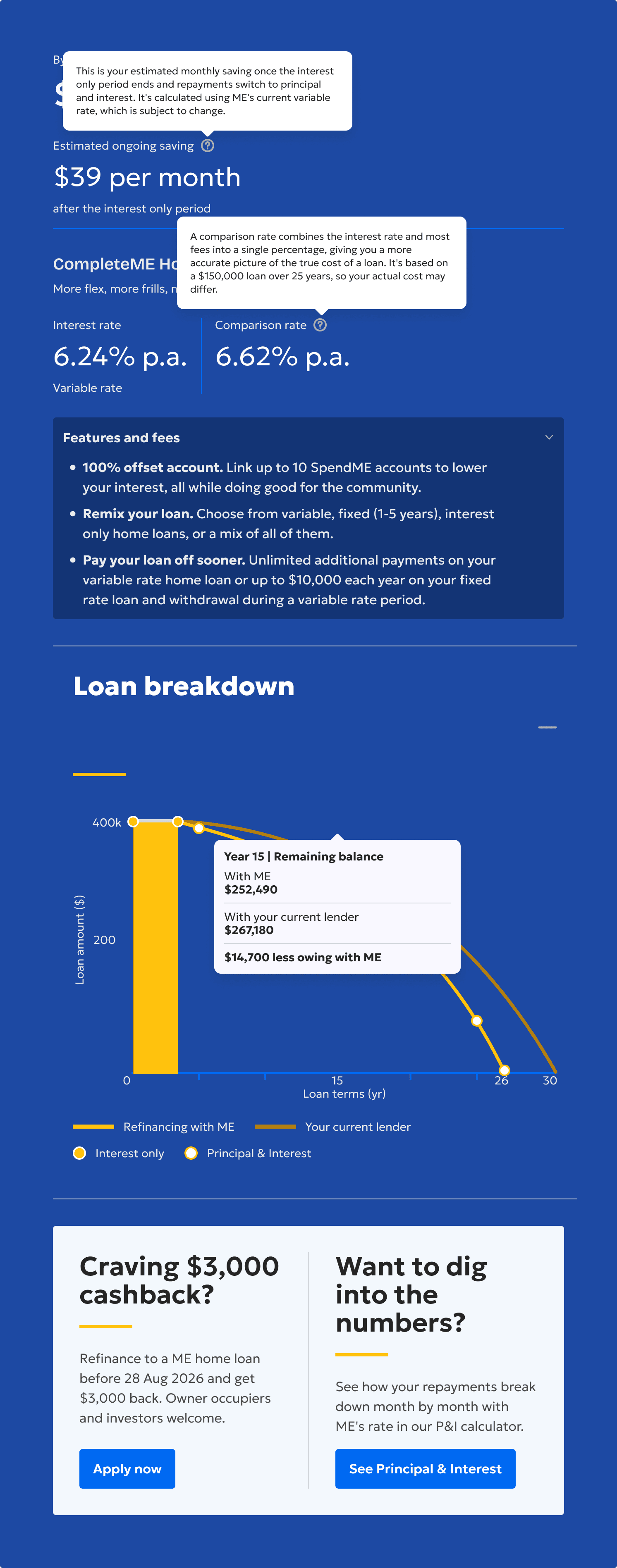
Calculation output tooltips: breakdown financial terminology

Info-box: Understand the implication of product choice
MOTION DESIGN
Making the Numbers Move
Motion was used with the same intent – counters that visibly recalculate, CTAs that only surface once someone’s engaged. So a result read as earned, not arbitrary.
Output animation
THE FIELD TEST
Validating with users
Two rounds of moderated usability testing ran alongside the design work and shaped it directly. Each round scored users on ease of navigation, confidence in finding the right tool, and how well the structure matched expectations.
2x
Testing rounds
16
Participants
45mins
Each session

Round 1 – Structure & Navigation
LOW FIDELITY
Does the Structure Guide users?
A low-fidelity prototype tested whether the new grouping and tab structure matched how people actually think about their own home loan journey — before a single pixel of the real interface existed.
Key findings

Round 2 – Clarity & Comprehension
HIGH FIDELITY
Does the Output Make Sense?
A second group tested a high-fidelity, interactive build – this time judged not on whether they could navigate it, but on whether the inputs, results and next steps actually made sense once they got there.
Key findings

Findings from both rounds were acted on directly: the Stamp Duty Calculator was relabelled to reflect what it actually covered, fees and product details were surfaced without needing a click, and assumption transparency was added across the Borrowing Power and Refinance Calculators. By the second round, satisfaction had moved from cautious to confident.
“This is the best mortgage calculator I’ve seen so far — it makes it a lot more relevant, a lot more user-friendly.”
– Subsequent Home Buyer
OUTCOME
From a Number to a Decision
Eight calculators shipped as one shared system across four brands, each carrying its own visual identity and tone while running on the same underlying equations and logic. In a category where every bank shows a version of the same maths, the differentiator was never the number itself – it was whether someone walked away understanding it, knowing what to do next, and seeing the appeal in what BOQ Group could offer them.
8
Homeloan Calculators
Eight home loan calculators delivered across four brands and three breakpoints.
16
User Interviews
Sixteen real users interviewed across two rounds, grounding decisions in observed behaviour.
49
Scenarios designed
Forty-nine product scenarios mapped, capturing each calculator’s full rules and logic.
202
Pages created
Two hundred and two desktop pages designed across the full suite in eight weeks.

Calculators go live end of October 2026, screens shown are final design, pending release.
Check out my other works