THE PROBLEM
A portal used daily by 7,100+ federal staff had become the thing people worked around, not with. Admins kept their own shortcut docs. New starters got lost. Managers had no idea where their approvals sat.
Program Athena came in for the fix – migrating from Cherwell to ServiceNow, and redesigning the experience from the ground up.
– Health Staff, current state research
– Team admin, current state research

Before: My self service portal (MSSP) homepage

MY ROLE
Sole UX/UI designer across this 7-month engagement, working within the Human-Centred Design team across service design, development, and business stakeholders
CONSTRAINT
ServiceNow's Employee Centre runs out-of-the-box by default: pre-built components, limited customisation. The mandate was to stay within that wherever possible, pushing existing components further through content hierarchy, copy clarity, and IA. When the gap was too wide, the case was made with evidence.

"How might we make an intuitive and trusted portal staff actually want to use. "
RESEARCH & TESTING
Two rounds of usability testing with 16 staff across diverse roles, tenure, and accessibility needs, including neurodiversity, disability, and Aboriginal and Torres Strait Islander networks.
Users
Testing rounds
Moderation ratio
Per session
Think-aloud sessions through the core request journey. Synthesised via affinity mapping and semantic tagging.

2.51
/ 5
Usability score - MSSP
Homepage was too busy – users wanted to get in and out fast
Search was distrusted from previous platform experience
Approval status was invisible throughout the process
Refined requester flow, new approver flow, baseline comparison against MSSP.

4.47
/ 5
Usability score - Service Centre
User quotes
"Seems less murky. I feel more confident using this system."
"Would be nice to have one service centre for everything."
"More professional than the current system. It was hard to find things before."


Affinity mapping - User quotes & observation
KEY DECISIONS
The homepage serves everyone at once. It went from a dense three columns of competing widgets to one focused page. Every element was tested, challenged, and either earned its place or didn't.

Proof of concept (Mid 2024)
Three columns, everything surfaced

Low fidelity (Jan 2025)
Layout refined, widgets reduced

Final (Mar 2025)
Tested, stripped back, shipped
The 570+ items catalogue had grown organically over years – some outdated, some duplicated, some mirroring the same software at different access tiers. The restructure revolved aroundstaff think about their needs, not how the organisation labels its services.

Taxonomy visualisation – 7 categories, 4 tiers. No Quick Reference Guide needed.
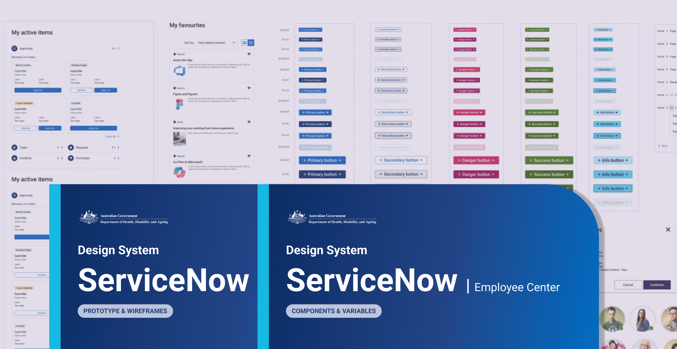
Health Design System
Every screen needed to feel like it belonged to Health – not a generic enterprise platform with a logo swapped in.
Adapted ServiceNow's Employee Centre into a Health-specific branch – colour tokens, typography, and components rebuilt to meet Health's visual identity, WCAG AA, and Australian Government standards across 20+ screen types. Clear enough rules that design intent survived the build, and every iteration after it.
The same questions kept coming from different teams. Instead of answering them again, a resource was built – covering taxonomy, form design, iconography, notifications, and branding. Built to be maintained by anyone, not just designers.


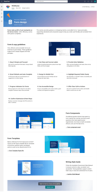
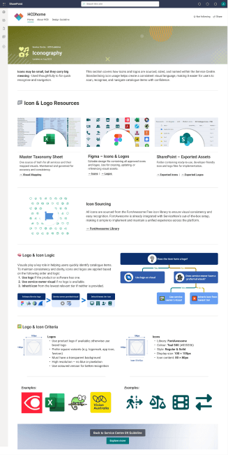


Service Centre Design Guideline Hub
OUTCOME
A platform staff had learned to avoid became one they use with confidence. The IA holds. The design system scales. The guidelines outlast the program.

7,100+
Staff supported
570+
Items restructured
64%
Usability uplift
110+
Program staff supported
“Much cleaner layout, more minimal and clearer to find items.”
“Flow makes more sense and I can see things really easily.”
- Federal health staffs, Round 2 user testing
Check out my other works